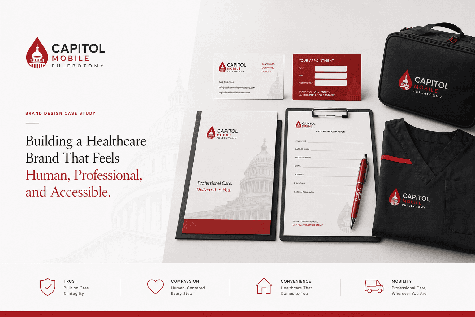
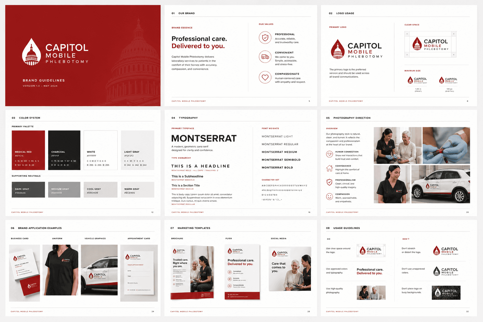
Capitol Mobile Phlebotomy
2026
Building a Healthcare Brand That Feels Human, Professional, and Accessible
Overview
Overview
Capitol Mobile Phlebotomy was created to make laboratory services more accessible for patients who struggle to visit traditional facilities.
The founder needed a professional healthcare brand that could communicate trust, convenience, and clinical expertise while differentiating the service from conventional laboratories.
The project focused on creating a complete visual identity system that could support future growth across digital and physical touchpoints.
Problem area
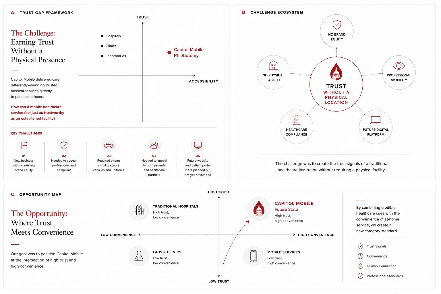
The Challenge: Building Trust Without a Physical Location
Most healthcare brands rely on clinics, laboratories, or hospitals to establish credibility.
Capitol Mobile operated differently.
Services were delivered directly to patients in their homes, creating a unique challenge:
How can a mobile healthcare service feel just as trustworthy as an established medical facility?
Additional Challenges
New business with no existing brand equity
Needed to appear professional and compliant
Required strong visibility across vehicles and uniforms
Needed to appeal to both patients and healthcare partners
Future website and patient portal were planned but not yet developed
Opportunity 1
Introduce data-driven guidance to reduce confusion and support tickets, helping businesses make decisions faster and stay engaged.
Opportunity 2
Transform static transaction data into clear insights, making it easier to act and improving retention.
Design goals
What I aimed to achieve
Create Trust
Patients should immediately feel safe and confident.
Communicate Convenience
Highlight healthcare brought directly to the patient.
Differentiate From Traditional Labs
Create a modern, approachable identity.
Build a Scalable Brand System
Support future marketing and digital products.
Build trust
Design a clear, reliable dashboard that keeps business owners in control.
Drive adoption
Add a test space so business owners explore freely, see wins, and stay engaged.
Drive adoption
Add a test space so business owners explore freely, see wins, and stay engaged.
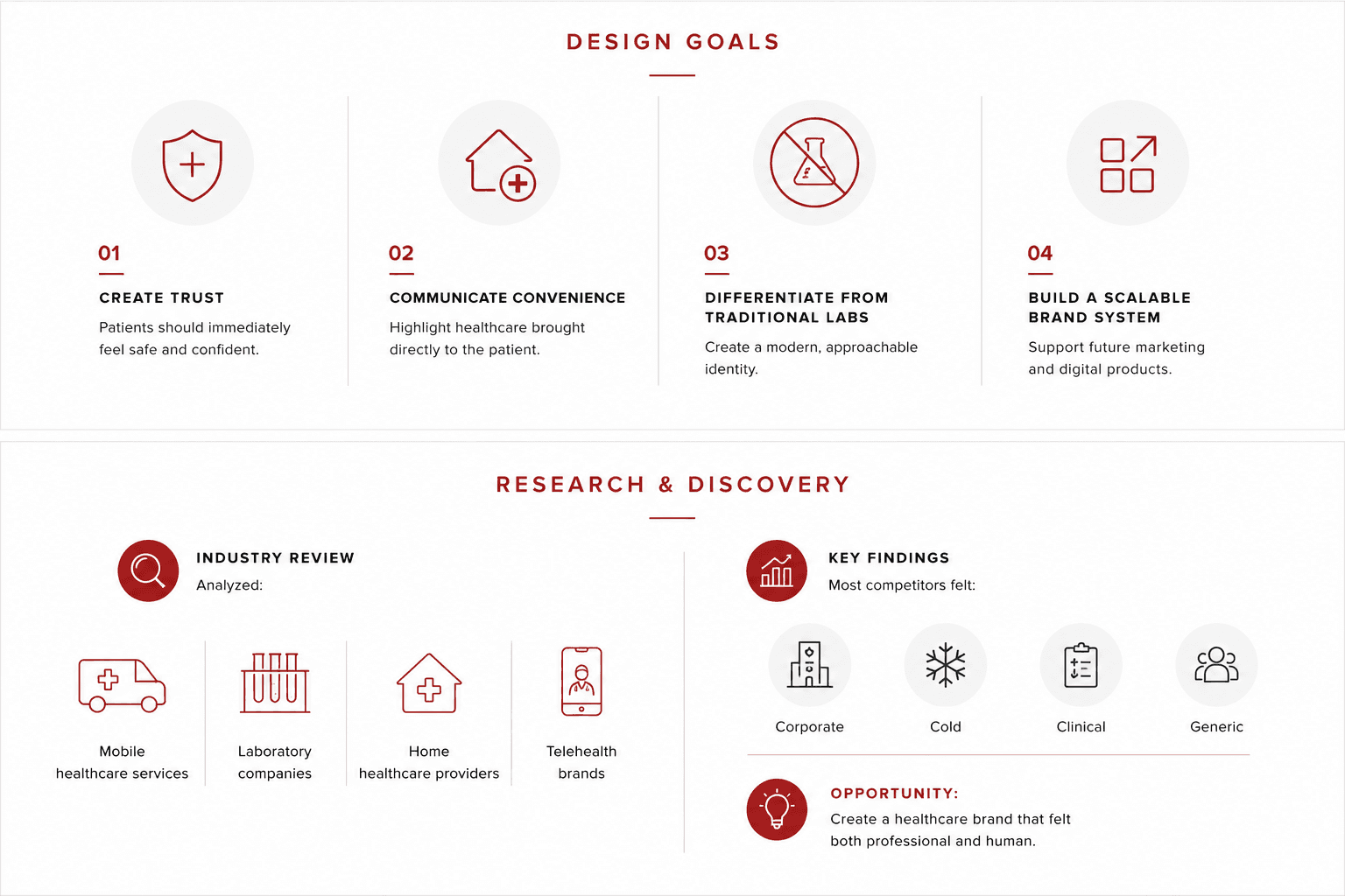
Research & Discovery
Industry Review
Analyzed:
Mobile healthcare services
Laboratory companies
Home healthcare providers
Telehealth brands
Key Findings
Most competitors felt:
Corporate
Cold
Clinical
Generic
Opportunity:
Create a healthcare brand that felt both professional and human.
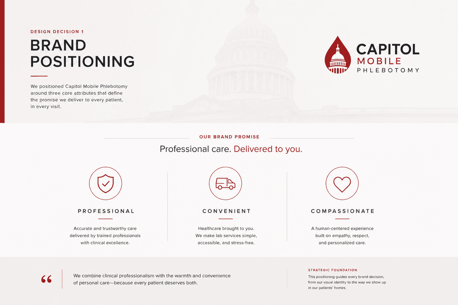
Design decision 01
1. Brand Positioning
The brand was positioned around three core attributes:
Professional
Accurate and trustworthy care.
Convenient
Healthcare delivered to patients.
Compassionate
Human-centered service experience.
Design decision 02
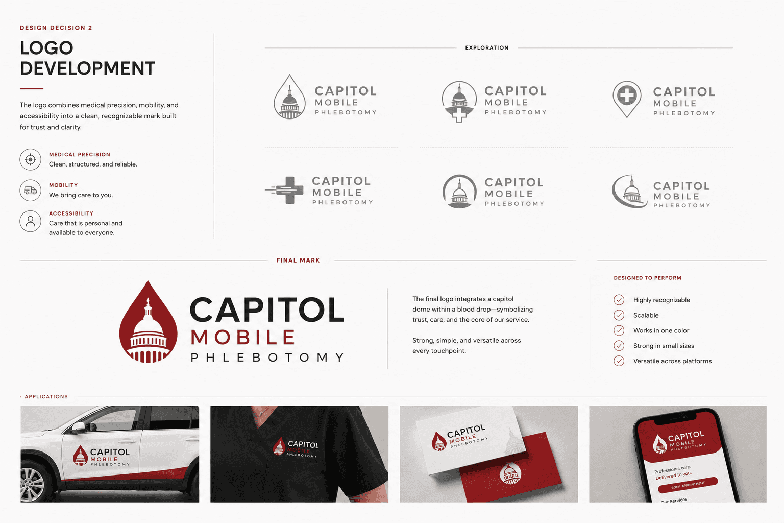
2. Logo Development
Logo Development
The logo combines:
Medical precision
Mobility
Accessibility
The final mark was designed to remain recognizable across:
Vehicles
Uniforms
Business cards
Digital platforms
Design decision 03
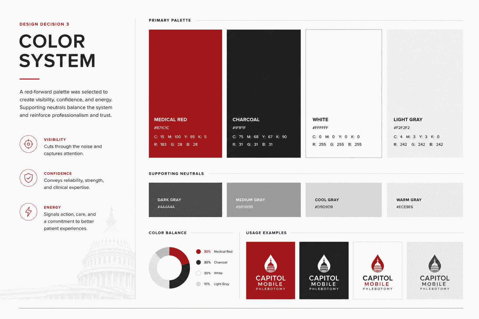
3. Color System
A red-forward palette was selected to create:
Visibility
Confidence
Energy
Supporting neutrals balanced the system and reinforced professionalism.
Primary Colors
Medical Red
Charcoal
White
Light Gray
Design decision 04
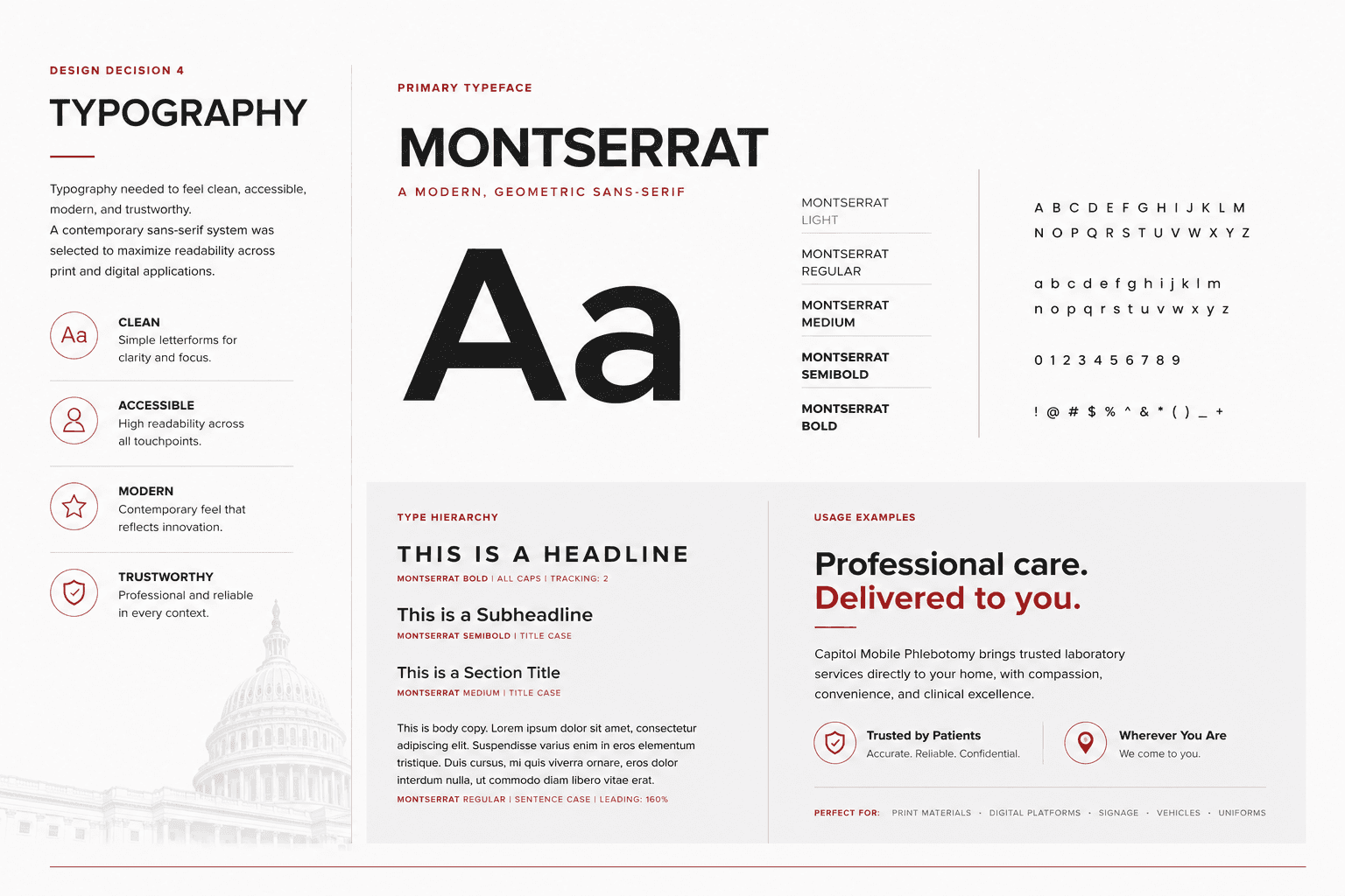
4. Typography
Typography
Typography needed to feel:
Clean
Accessible
Modern
Trustworthy
A contemporary sans-serif system was selected to maximize readability across print and digital applications.
Design decision 05
5. Brand Applications
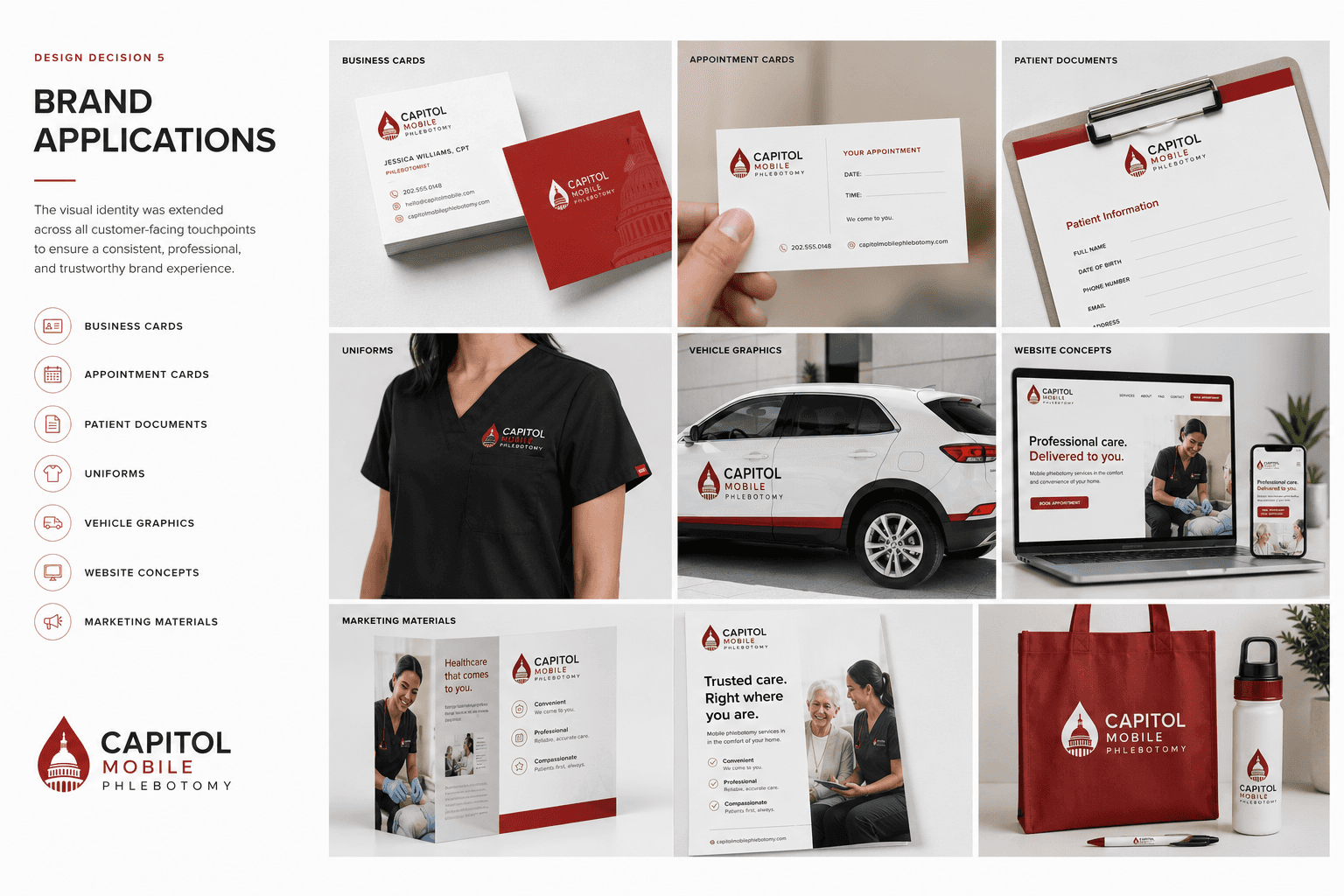
Brand Applications
The visual identity was extended across all customer-facing touchpoints.
Applications
Business Cards
Appointment Cards
Patient Documents
Uniforms
Vehicle Graphics
Website Concepts
Marketing Materials
Design decision 06
5. Brand System
To ensure consistency, a flexible visual system was created including:
Logo usage rules
Color guidelines
Typography hierarchy
Photography direction
Marketing templates
Design decision 07
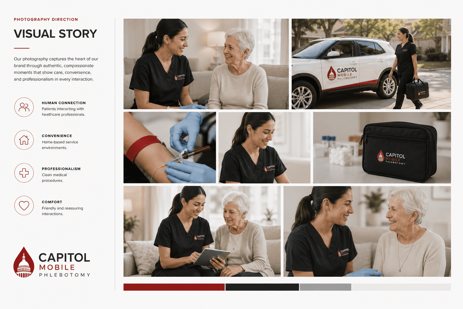
6. Photography Direction
Photography emphasized:
Human Connection
Patients interacting with healthcare professionals.
Convenience
Home-based service environments.
Professionalism
Clean medical procedures.
Comfort
Friendly and reassuring interactions.
Outcome
Outcome
The final identity established a strong foundation for a growing healthcare company.
The system helped communicate credibility, professionalism, and convenience while creating a memorable healthcare experience.
Retrospective
Key Takeaways
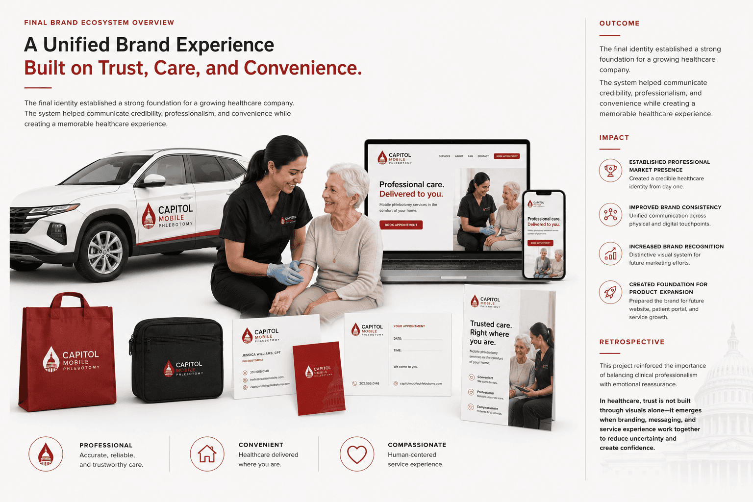
This project reinforced the importance of balancing clinical professionalism with emotional reassurance.
In healthcare, trust is not built through visuals alone—it emerges when branding, messaging, and service experience work together to reduce uncertainty and create confidence.
Impact
Created Foundation for Product Expansion
Prepared the brand for future portal, and service growth.
Increased Brand Recognition
Distinctive visual system for future marketing efforts.